
How to Design Color-Blind-Friendly Minecraft Skins Without Losing Detail
Minecraft skins may use a small pixel canvas, yet they can communicate an impressive amount of personality. A carefully selected palette can turn a basic character into a memorable knight, athlete, wizard or explorer.
However, if important features rely only on subtle colour differences, some players may struggle to see the design as intended.
Designing a colour-blind-friendly Minecraft skin does not mean removing colour or making everything extremely simple. Instead, it means using colour alongside contrast, shapes and patterns so the character remains clear to more players.
Start With Strong Contrast
Contrast describes the difference between light and dark areas. It is especially important in Minecraft because skins are viewed from different distances, under changing light and against colourful environments.
If a shirt and jacket have almost the same brightness, they may blend together even when their colours are technically different. Therefore, try pairing a dark jacket with a lighter shirt or placing a bright detail against a deeper background.
You can test the contrast by temporarily viewing your design in grayscale. If the major features remain easy to recognise without colour, the structure of the skin is probably strong. However, if the clothing, hair and accessories merge into one shape, adjust their brightness before adding further details.
Avoid Relying on Red and Green Alone
Red-green colour-vision differences are among the most common, so using only those colours to separate important features can create confusion. For example, a red team symbol placed on a similarly dark green shirt might disappear for some viewers.
You do not have to avoid these colours completely. Instead, support them with other visual signals. Add a light outline around the symbol, give each area a different pattern or use clearly different brightness levels. In this way, the design remains understandable even when the colours appear more similar to a particular player.
The same principle applies to blue and purple combinations. Although they may look distinct on your screen, they can become difficult to separate when their brightness and saturation are too similar.
Use Patterns and Shapes as Visual Clues
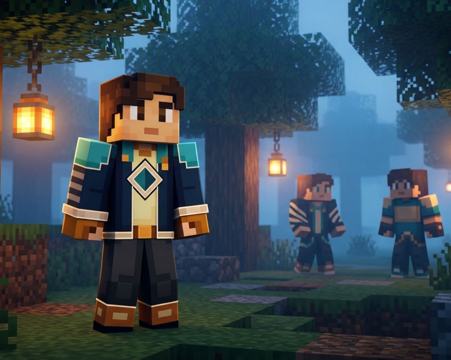
Patterns give a skin character while also making it more accessible. Stripes, checks, borders, shoulder panels and contrasting cuffs can distinguish pieces of clothing without depending entirely on colour.
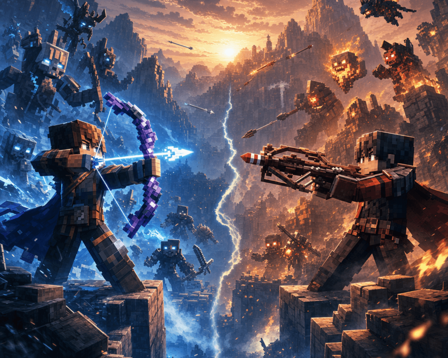
Suppose you are designing two skins for opposing teams. Rather than changing only the shirt colour, you could give one team diagonal stripes and the other a solid chest panel. Consequently, players can identify each team through both colour and structure.
You can also explore different character styles on Minecraft Skins to see how recognisable patterns, contrasting accessories and clearly defined clothing help designs remain distinctive on a small pixel canvas.
Distinct silhouettes also help. A bright scarf, contrasting gloves, unusual boots or a recognisable head accessory can make a character easier to identify while moving through the game.
Preview the Skin in Real Conditions
A skin can look perfectly clear inside an editor and still lose detail during gameplay. For that reason, preview it against several backgrounds, including forests, caves, snowy areas and busy multiplayer environments. You should also rotate the model because a strong front design may have weak or confusing sides.
Colour-vision simulation tools can provide another useful check, although they should complement rather than replace contrast testing. Pay attention to what happens to the major features instead of worrying about preserving every tiny shade.
Most importantly, keep your creative idea at the centre of the design. Accessibility is not a restriction; rather, it encourages stronger choices. When colour, contrast, patterns and shapes support one another, your Minecraft skin becomes clearer, more expressive and more memorable for everyone who encounters it.
#MinecraftSkins #AccessibleGaming #ColorBlindFriendly #MinecraftDesign #SkinDesignTips #MinecraftCustomization #InclusiveDesign #PixelArt